

User Manual — v3.2.0
ML Cabinets 3.2.0 is the current public release documented on this page.
Professional parametric cabinet design for SketchUp 2024–2026
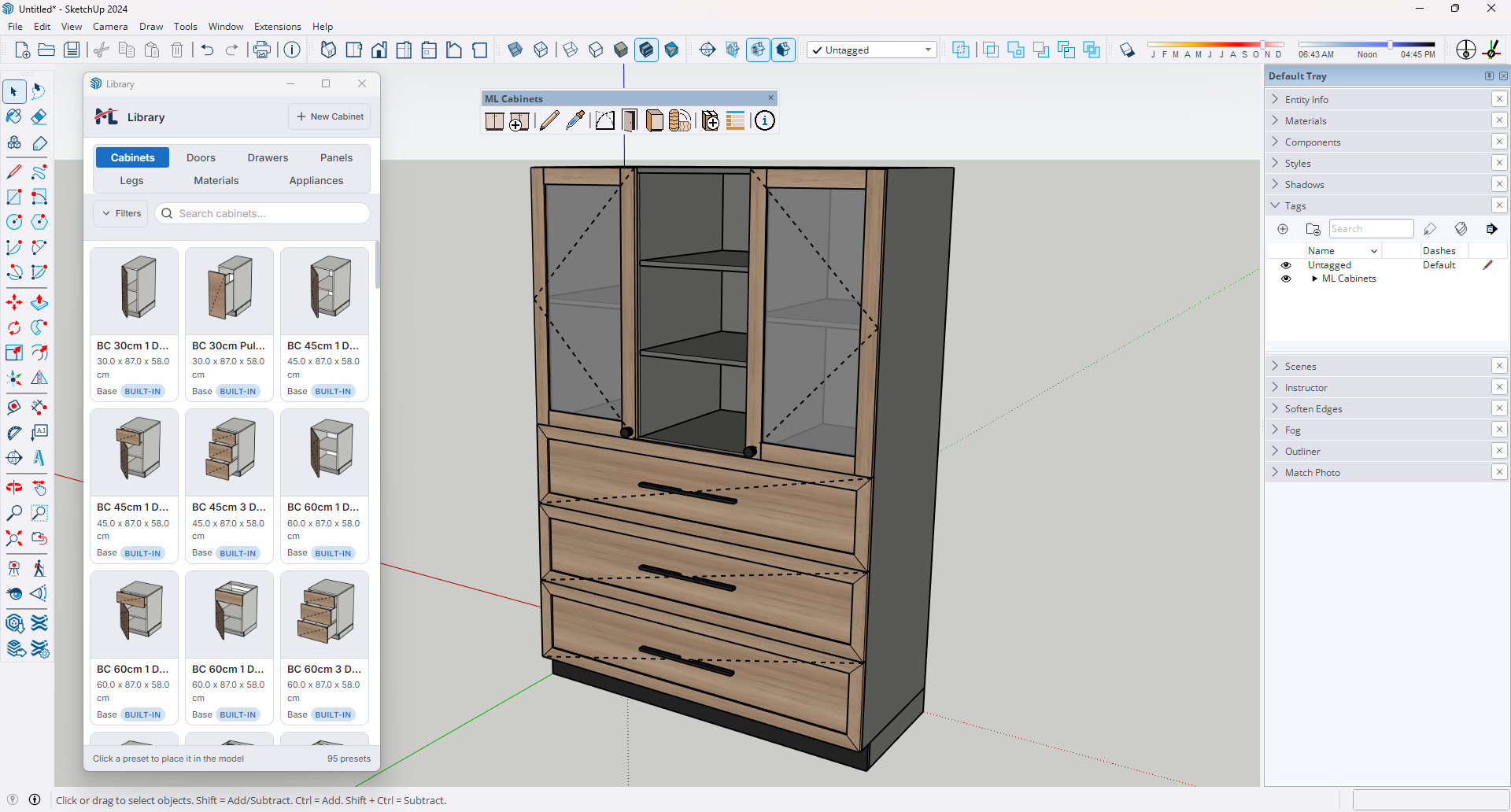
ML Cabinets is a professional SketchUp 2024–2026 extension for designing and placing fully parametric modular cabinets directly inside any 3D model — from kitchen cabinetry and dressing room wardrobes to TV units, bathroom vanities, office storage, and retail fixtures.
Every cabinet is built as a live Dynamic Component: resize it, and every panel, shelf, and interior zone updates in under a second. From a single dialog you control type, dimensions, construction details, interior layout, materials, and hardware — then click Create, position the wireframe preview exactly where you want it, and click to place.
 Design — Seven-tab configuration panel with live 3D preview for complete cabinet control. Design — Seven-tab configuration panel with live 3D preview for complete cabinet control. |  Edit — In-place modification, bulk editing, and style picker for rapid iteration. Edit — In-place modification, bulk editing, and style picker for rapid iteration. |  Library — Save and reuse cabinets, doors, handles, profiles, appliances, and materials. Library — Save and reuse cabinets, doors, handles, profiles, appliances, and materials. |  Schedule — Auto-generated project schedule with pricing, exports, and client info. Schedule — Auto-generated project schedule with pricing, exports, and client info. |
Getting Started
The ML Cabinets Toolbar
When SketchUp loads ML Cabinets, a dedicated toolbar appears automatically with one-click access to every tool in the extension.

The toolbar provides these buttons, from left to right:
| Icon | Tool | Description |
|---|---|---|
| Library | Browse saved cabinet presets and place them directly in the model. |
| New Cabinet | Open the full configuration dialog to design a cabinet from scratch. |
| Edit Cabinet | Reopen a placed cabinet's configuration for in-place modification. |
 | Style Picker | Copy a cabinet's style and paste it onto other cabinets — like Format Painter. |
 | Swap Door Opening | Flip a door's hinge direction with a single click. |
 | Open / Close | Animate doors and drawers open or closed for presentations. |
 | End Panel | Click an exposed cabinet side to add a decorative end panel. |
 | Swap Grain Direction | Toggle material grain direction on doors, drawers, panels, and blind face panels. |
 | Add to Library | Save the selected component as a reusable preset. |
| Schedule Manager | View and export a schedule of all cabinets in the model. |
Tip: All toolbar commands are also available from Extensions → ML Cabinets in the menu bar and from the right-click context menu.
Your First Cabinet — Quick Start
- Click New Cabinet on the toolbar.
- Choose a Cabinet Type from the dropdown on the General tab (e.g., Base Cabinet).
- Adjust dimensions, materials, and interior layout across the seven tabs.
- Watch the Live 3D Preview update as you make changes.
- Click Create Cabinet — a wireframe preview follows your cursor.
- Click anywhere in the viewport to place the cabinet.
New Cabinet Dialog
The New Cabinet dialog is a purpose-built seven-tab configuration panel that gives you complete control over every dimension, construction detail, interior layout, material, and hardware choice before a single object is placed in your model.
Open it from the ML Cabinets toolbar, configure your cabinet across seven logically organised tabs — General, Construction, Configuration, Doors, Drawers, Panels, Materials — then click Create to enter the interactive Placement Tool.
Cabinet Types & Presets
Seven ready-made cabinet archetypes — each pre-loaded with the correct default dimensions, toe kick settings, construction options, and starter interior layout — so your first click always produces a plausible, real-world cabinet.
| Type | Default Width | Default Height | Default Depth | Notes |
|---|---|---|---|---|
| Base Cabinet | 60 cm / 24 in | 82 cm / 32.25 in | 58 cm / 23 in | Toe kick on, back stretchers |
| Wall Cabinet | 60 cm / 24 in | 60 cm / 24 in | 35 cm / 14 in | No toe kick, mounts at 145 cm / 57 in |
| Tall Cabinet | 60 cm / 24 in | 200 cm / 78.75 in | 58 cm / 23 in | Toe kick on, closed back |
| High Cabinet | 60 cm / 24 in | 220 cm / 87 in | 58 cm / 23 in | Toe kick on, three-door stack |
| Base Corner | 90 cm / 36 in | 72 cm / 28.5 in | 90 cm / 36 in | Square footprint, double door |
| Wall Corner | 90 cm / 36 in | 60 cm / 24 in | 35 cm / 14 in | Wall-mount, double door |
| Filler | 6 cm / 2.5 in | 72 cm / 28.5 in | 58 cm / 23 in | Narrow panel to close gaps |
Note: Each type seeds the interior configuration list and pre-selects matching door, handle, and material presets so the cabinet looks finished from the first click.
Make Default & Restore Factory Defaults
Two footer buttons — Make Default and Restore Defaults — let you save and reset your personal starting point for any cabinet archetype, so the dialog pre-loads with your preferred values every time you create a new cabinet of that type.
Make Default
Configure any combination of settings across all seven tabs for the currently selected cabinet type — dimensions, construction options, interior layout, materials, hardware — then click Make Default in the dialog footer.
- A confirmation prompt names the type being updated, for example: "The current settings will replace the defaults for 'Base Cabinet'. This only affects new cabinets of this type."
- Click Confirm. A brief toast notification confirms the save.
- From this point on, every new cabinet of that type opens with your saved values — dimensions, materials, interior layout, and hardware included.
Restore Defaults
Click Restore Defaults in the dialog footer to discard your saved preferences for the current cabinet type and return to the original factory settings.
- A confirmation prompt shows whether user-saved defaults exist for that type. If none have been saved, the dialog informs you that the type is already using factory settings.
- Confirm to restore — the dialog reloads with the original shipped defaults for that type.
Scope: Defaults are saved per cabinet type and are completely independent of each other. Saving defaults for a Base Cabinet does not affect your Wall Cabinet or Tall Cabinet starting points. Neither operation modifies cabinets already placed in the model — they affect only what the dialog shows the next time it is opened.
General Tab
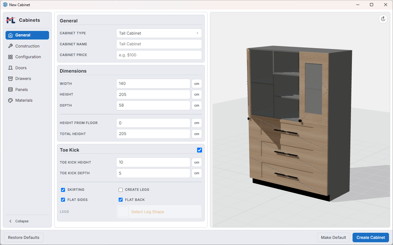
The General tab controls the cabinet's fundamental properties:
Cabinet Type & Name
- Cabinet Type — select from seven archetypes; all other fields update to match.
- Cabinet Name — a descriptive label used in the Schedule Manager.
- Cabinet Price — unit price for cost calculations in the schedule.
Dimensions
- Width, Height, Depth — overall cabinet envelope in your active unit (cm or in).
- Height from Floor — vertical offset for wall-mounted cabinets (default 145 cm for wall cabinets, 0 for base).
- Total Height — computed value showing height from floor + cabinet height.
Dual-Unit Support
The dialog reads the active SketchUp model's unit system and switches all dimension inputs, step increments, and default values between centimetres and inches automatically. When you click Create, the dialog converts every value back to SketchUp's internal inches — no rounding errors.
Toe Kick
Controls the base construction of floor-standing cabinets:
- Toe Kick Height — vertical rise (default 10 cm / 4 in for base and tall cabinets).
- Toe Kick Depth — setback from the front face.
- Skirting — continuous solid plinth panel.
- Create Legs — replace the plinth with four individual leg components. Select a leg style from six built-in presets or custom saved presets.
- Flat Sides / Flat Back — control which faces of the plinth are recessed by the setback distance.
Construction Tab
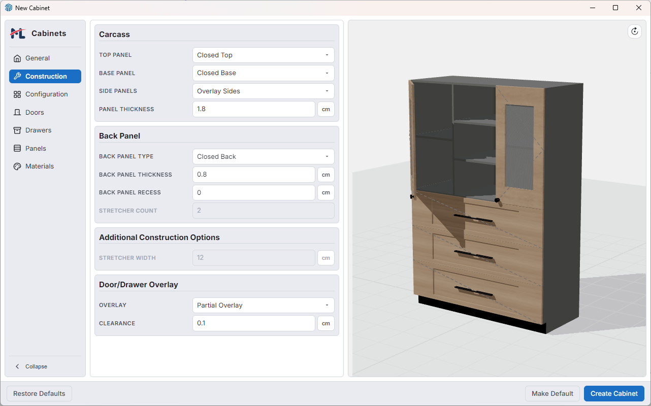
Controls structural construction details that affect how the cabinet is built:
Corner Type (Corner cabinets only)
Appears only when a Base Corner or Wall Corner cabinet type is selected. Chooses between two fundamentally different ways to handle the corner footprint:
| Mode | Geometry | Best For |
|---|---|---|
| L-Shaped | Two wings meet at 90°. The total footprint is the sum of both wing depths, forming a true L. Both wings are accessible and fully modelled. | Open-plan kitchens, walk-in wardrobes, and any corner where both sides are equally accessible and the full corner volume needs to be used. |
| Blind Corner | A rectangular box whose total width equals the accessible door opening + cabinet depth + a blind margin (8 cm in metric mode, 3 in / 7.62 cm in imperial mode). The accessible opening sits on one nominated side; the rest of the carcass extends behind the adjacent cabinet as hidden storage. A full-height blind face panel automatically closes the visible gap at the front of the blind zone, finished in the door material with independent grain direction control. | Tight kitchen runs and bathroom vanity layouts where one side of the corner is blocked by an adjacent cabinet or wall, and only one face of the corner unit is reachable. |
Accessible Side (Blind Corner only)
When Blind Corner is selected, the Accessible Side dropdown determines which side of the box carries the doors, drawers, and interior groups:
- Right — the door opening faces right; the hinge is on the left edge of the door.
- Left — the door opening faces left; the hinge is on the right edge of the door.
Changing the accessible side automatically updates the hinge direction on all door items in the Configuration tab so the door swings away from the adjacent cabinet.
Note: The Corner Type and Accessible Side selectors are hidden for all non-corner cabinet types. They appear automatically as soon as a corner archetype is chosen from the Cabinet Type dropdown.
Side Panels
Controls how side panels relate to top and bottom panels — whether they sit between them (butt joint) or outside them (overlap joint):
| Mode | Top / Bottom Position | Best For |
|---|---|---|
| Overlay Sides | Top and bottom panels sit between the side panels | Sleek, minimal contemporary kitchens |
| Inset Sides | Side panels rest on the base panel, and the top panel sits on the side panels | Traditional and transitional kitchens |
| Full Height Sides | Sides span the entire height of the cabinet covering the toe kick | Last cabinet in a run, provides a continuous side panel that covers the toe kick |
Door / Drawer Overlay
Controls how door panels and drawer fronts relate to the cabinet opening:
| Mode | Face Position | Best For |
|---|---|---|
| Partial Overlay | Extends beyond opening, offset inward by clearance | Traditional and transitional kitchens |
| Full Overlay | Extends beyond opening, no clearance offset | Sleek, minimal contemporary kitchens |
| Inset | Sits entirely inside the opening | High-end bespoke furniture |
- Clearance — gap between adjacent faces (default 0.1 cm / 0.0625 in).
- Panel Thickness — structural panel thickness for carcass components.
- Back Panel Thickness — typically thinner than side panels.
- Back Panel Type — Closed (full sheet), Stretchers (open with cross-members), or None.
Tip: Changing the overlay type on a placed cabinet (via Edit Cabinet) instantly resizes every sub-component without rebuilding.
Configuration Tab
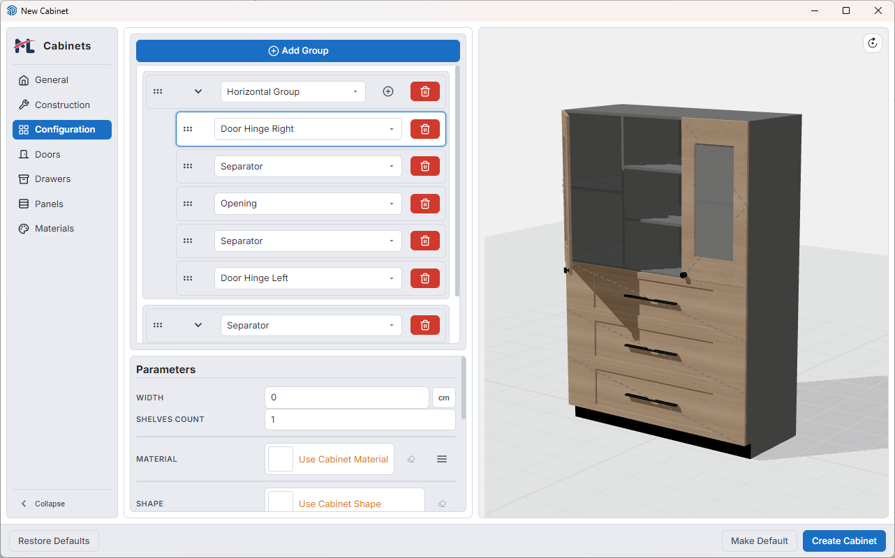
The Configuration tab is where you define the cabinet's interior layout — the arrangement of doors, drawers, shelves, openings, and any other zone that makes up the inside of the cabinet.
Group Layout System
The interior is divided into groups — independent layout zones. Each group arranges its child items in one direction:
- Vertical Group — openings stack top to bottom.
- Horizontal Group — openings sit side by side.
- Separator — full-depth structural panel between groups.
- Divider — thin front-facing strip between groups.
Set a group height, or leave it at 0 to fill the remaining interior height automatically.
Item & Opening Types
Opening and structural item types, each with type-specific parameters:
- Door — Hinge Right
- Door — Hinge Left
- Door — Hinge Top
- Door — Hinge Bottom
- Double Door
- Sliding Door
- Bi-Fold Door
- Lift Door
- Drawer
- False Drawer
- Panel
- Opening
- Appliance
- Separator
- Divider
- Blank
- Profile
Click an item row to select it and the Parameters panel populates with only the fields relevant to that type.
Shelves
Set Shelves Count in the Parameters panel for any door or opening item. Choose Equidistant spacing for automatic distribution or Custom spacing to set each clear space below. Shelf layouts recalculate safely when cabinet height changes.
Drawer Box
Every drawer item automatically generates a four-panel drawer box (two sides, a back, and a bottom) with configurable top and bottom clearances. Eligible hinged doors, double-door pairs, and regular drawers can also contain one level of sibling Inner Drawers with their own height, box, inset front, handle or profile, material, and opening amount.
Drag-and-Drop Reordering
Every group and item has a grip handle (six dots) on its left edge. Click and drag to reorder groups and items, or move items between groups. A blue drop-indicator tracks where the element will land.
Automatic Dividers
The extension automatically inserts hidden structural dividers between every pair of adjacent openings. These auto-dividers appear with a dashed border and italic label — they are locked and cannot be selected or deleted. Add a manual Separator, Divider, or Profile item to make a boundary visible in the 3D model.
Doors Tab
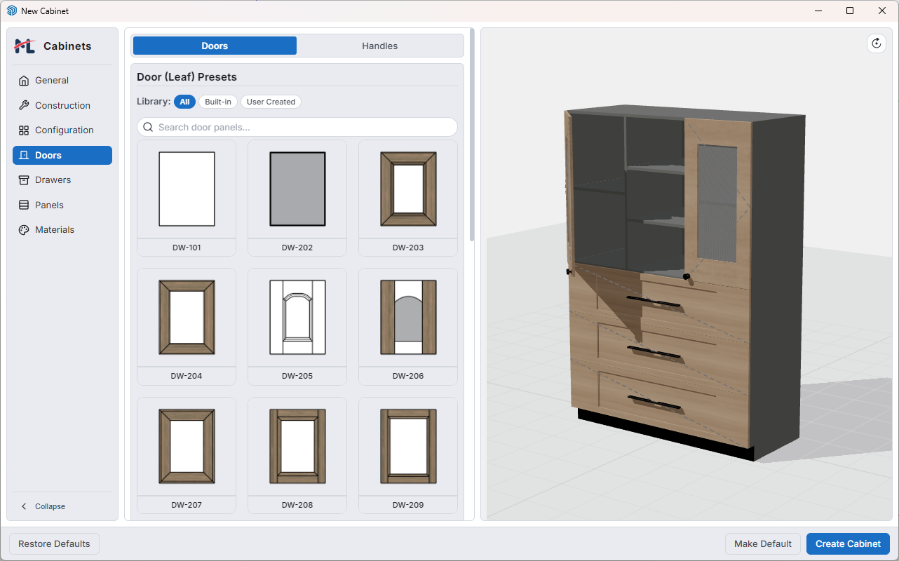
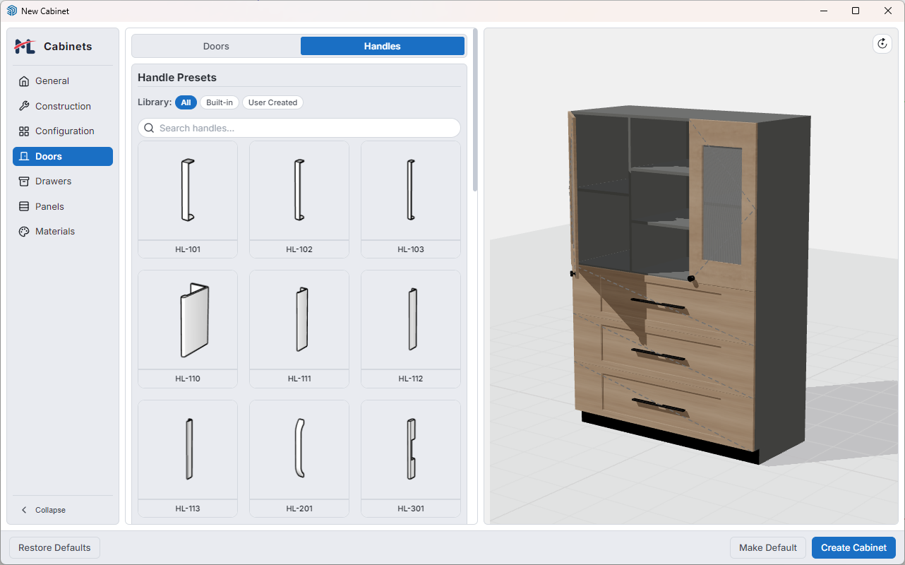
Configure door leaf shapes and door handle presets at the cabinet level:
- Door Shape — browse a grid of six built-in door leaf shapes (LF-401 – LF-406) plus any user-created presets. Click a card to set it as the project default.
- Door Handle — browse six built-in handle styles (HL-401 – HL-406) plus custom saved handles.
Filter presets using the All, Built-in, and User Created pill tabs.
Note: Per-item overrides on the Configuration tab let you use different shapes and handles on individual doors within the same cabinet.
Drawers Tab
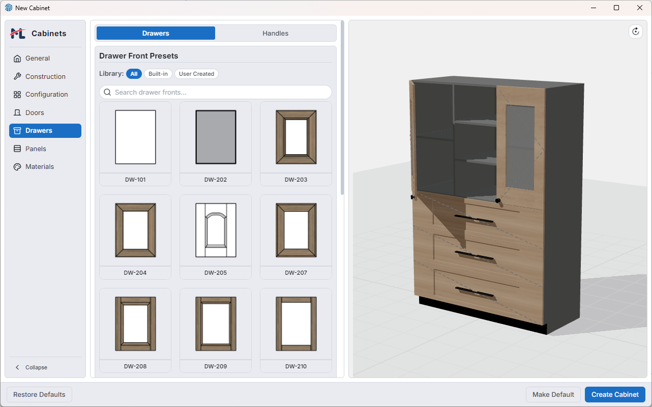
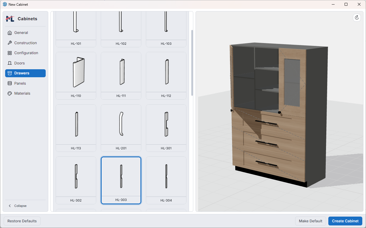
Configure drawer face shapes and drawer handle presets:
- Drawer Face Shape — six built-in drawer box types (DR-401 – DR-406) plus user presets.
- Drawer Handle — six built-in drawer handle styles (HL-421 – HL-426) plus custom saves.
Use the handle rotation control to set the required horizontal or vertical drawer-handle orientation.
Panels Tab
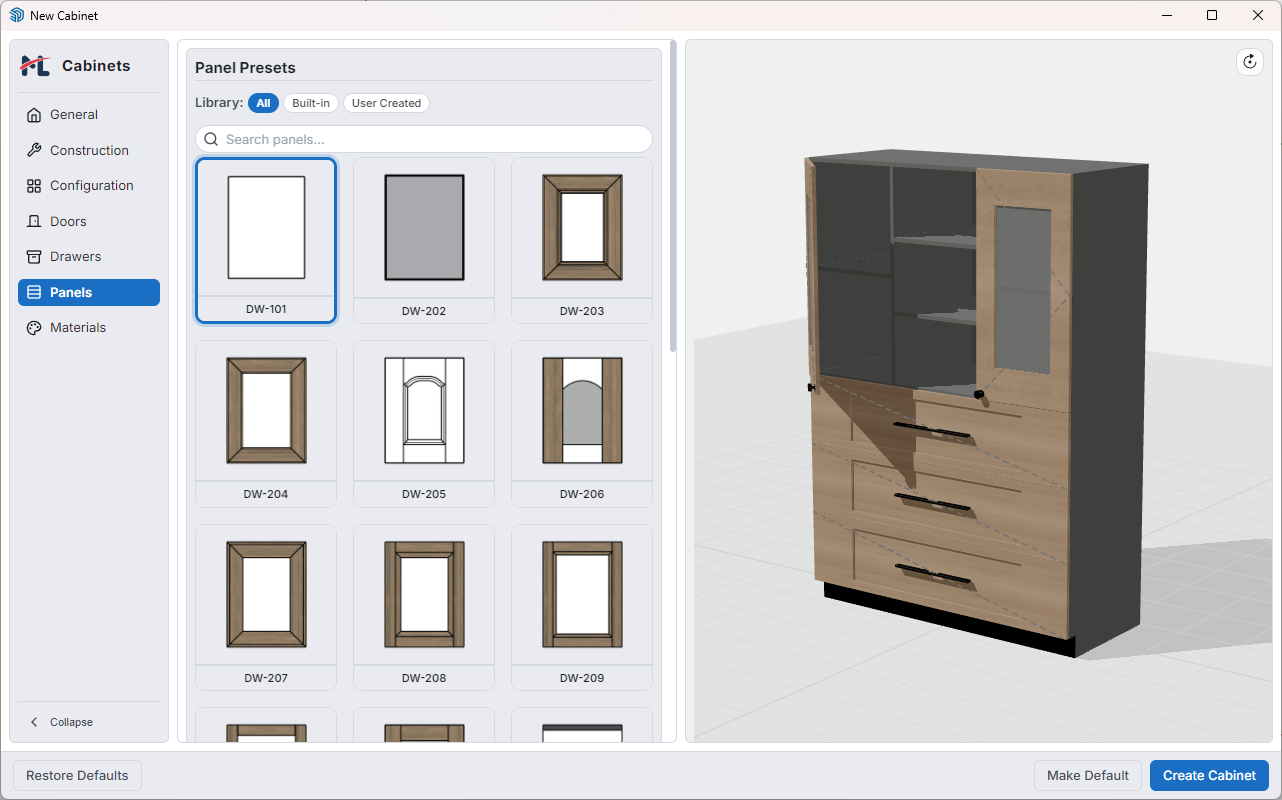
Configure panel face presets for Panel item types and End Panels. Browse door panels, drawer fronts, decorative panels, and end panel presets from the library. Panels tagged as "Decorative Panel" or "End Panel" appear here for selection.
Materials Tab
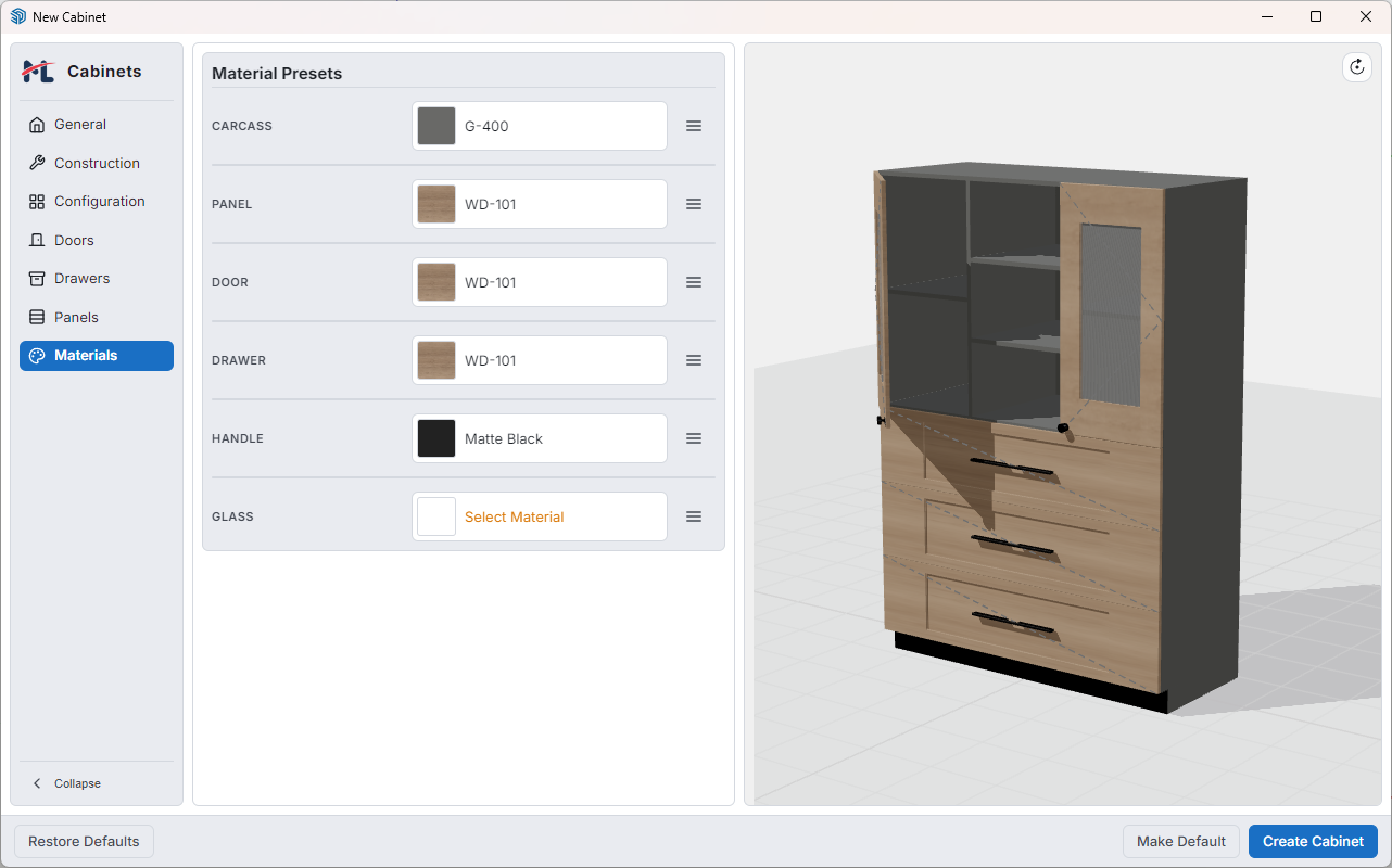
Assign distinct finishes to every surface of the cabinet from a visual picker with coloured swatches.
Material Categories
| Category | Presets |
|---|---|
| Wood | White Oak, Walnut, Birch, Wenge |
| Marble | Calacatta, Nero Marquina, Emperador |
| Metal | Brushed Steel, Matte Black, Brass |
| Colour | Alpine White, Anthracite, Navy Blue, Sage Green |
| Glass | Clear Glass, Frosted Glass, Smoked Glass |
Assignable Surfaces
| Surface | What It Controls |
|---|---|
| Carcass | All structural panels — sides, top, base, back, toe kick |
| Panel | Decorative panel faces and end panels |
| Edge Banding | Exposed panel edges |
| Door Front | Door leaf faces |
| Drawer Front | Drawer face panels |
| Handle | Handle hardware and profile extrusions |
| Glass | Glazed panel inserts |
Per-Item Material Override
On the Configuration tab, select any door or drawer item, then use the Material selector in the Parameters panel to override the cabinet-level finish for that specific opening. Set grain direction independently per item.
Tip: Separating Carcass and Panel materials means your visible end panels can carry a premium veneer while the interior box stays in a cost-appropriate sheet material.
Live 3D Preview
An interactive PBR preview of your cabinet is built in real time directly inside the New Cabinet dialog. The preview updates automatically after every change — switching a material, adding a drawer, changing the toe kick height, or rearranging zones.
What's Rendered
- Complete carcass with accurate panel geometry
- Interior layout zones, separators, and dividers
- Adjustable shelves with equidistant or custom spacing
- Drawer boxes with correct clearances
- Door and drawer panels with shape presets and materials
- Handle hardware at configured offsets
- PBR materials — wood, marble, metal, glass — with realistic lighting
Interaction
- Orbit — click and drag to rotate the view.
- Zoom — scroll wheel to zoom in and out.
- Pan — right-click drag to pan the view.
- Open/Close — click any door or drawer in the preview to animate it open.
Placement & Interaction
Interactive Placement Tool
After clicking Create, the dialog closes and a colour-coded wireframe preview follows your cursor in real time. Keyboard shortcuts let you refine position before you click to place.
Wireframe Visual Cues
- Blue edges — back and sides of the bounding box.
- Green edges + arrow — front face and direction.
- Orange cross-hair — active insertion corner.
Keyboard Shortcuts
| Key | Action |
|---|---|
← / → | Cycle insertion corner (back-right → back-left → front-left → front-right) |
↑ / ↓ | Toggle vertical anchor between bottom and top edge |
[ / ] | Rotate cabinet 90° counter-clockwise / clockwise |
Space | Cancel placement |
Tip: Corner, anchor, and rotation settings are remembered between placements in the same session.
Open / Close Interactive Tool
Click any door or drawer in a placed cabinet to animate it open or closed in real time. Click again to toggle it back.
Supported Hinge Types
| Door Type | Hinge Edge | Opens Toward |
|---|---|---|
| Single door (right hinge) | Right edge | Left |
| Single door (left hinge) | Left edge | Right |
| Hinge top | Top edge | Upward |
| Hinge bottom | Bottom edge | Downward |
| Double door | Left + right edges | Both leaves outward |
Drawers slide outward by their configured opening percentage. Each animation shifts the door by one panel thickness for realistic clearance.
Dynamic Component Intelligence
Every sub-component is driven by formulas that chain back to the root cabinet's dimensions. Resizing with SketchUp's Scale tool automatically updates every child component.
Cabinet (root)
  └── Group (layout zone)
        └── Item (opening)
              └── Shelf & Drawer Box
Panels maintain their specified thickness regardless of scaling — a 1.8 cm panel stays 1.8 cm. The formula chain ensures all geometry recalculates in a single evaluation pass.
Editing Tools
Edit Cabinet — In-Place Modification
Reopens any previously placed cabinet in the same configuration dialog with every setting restored. Change dimensions, interior layout, materials, handles, or any parameter and apply the update without deleting or repositioning.
- Select a cabinet and click Edit Cabinet on the toolbar (or right-click → ML Cabinets → Edit Cabinet).
- The dialog opens in Edit mode — title bar reads "Edit Cabinet" and the footer shows Apply.
- Make your changes across any tab.
- Click Apply — the cabinet rebuilds in place. Position and rotation are preserved.
Note: Undo is fully supported — a single Ctrl+Z reverts the cabinet to its pre-edit state.
Bulk Edit — Multi-Cabinet Editing
Select two or more cabinets and open Edit Cabinet. The dialog shows shared settings normally and differing settings with a ••• mixed-value indicator. Only fields you modify are applied — everything else stays at each cabinet's original value.
- Select multiple cabinets with
Shift+Click or a selection box. - Click Edit Cabinet — a banner reads "Editing N cabinets".
- Modify only the fields you want to unify.
- Click Apply — all selected cabinets update simultaneously.
Style Picker — Copy & Apply Cabinet Styles
Works like a Format Painter for cabinets. Pick a source cabinet's style, then click targets to apply it.
- Click Style Picker on the toolbar — cursor changes to an eyedropper.
- Click a cabinet to pick its style (outlined in green).
- Click other cabinets to apply the style — they rebuild in place.
- Press
Escto re-pick a different source, orEscagain to exit.
Pro Tip: Hold Alt while clicking the source to open a filter dialog — choose exactly which properties to transfer (dimensions, materials, configuration, etc.). The filter selection is remembered for the rest of the session.
Swap Door Opening — One-Click Hinge Flip
Flips a door's hinge direction with a single click. Hover over a door (orange highlight confirms the target), click to flip. The handle repositions and all construction details update automatically.
- Vertical doors: left-hinged ↔ right-hinged
- Horizontal doors: top-hinged ↔ bottom-hinged
- Double doors are unaffected
Swap Grain Direction — One-Click Grain Toggle
Toggles material grain between vertical and horizontal on any door, drawer front, decorative panel, end panel, or blind face panel. Hover (cyan wireframe highlights valid targets), click to toggle. The UV mapping rotates 90° in place.
Grain overrides are saved per item and survive re-edits and Style Picker transfers.
Blind face panel support: On blind corner cabinets, the front-facing strip that closes the blind zone is also a valid grain target. Click it to toggle its grain independently of the main door panels — the override is stored separately in the cabinet configuration and persists through edits and rebuilds.
End Panel Tool — Decorative Side Cladding
Click any exposed cabinet side to place a correctly sized decorative end panel. The panel uses the cabinet's Panel material and panel shape preset automatically.
- Activate the End Panel tool from the toolbar.
- Hover over a cabinet side — orange wireframe highlights the target face.
- Click to place the decorative end panel.
To re-face an existing end panel, use the Asset Library's Panels tab: click a preset card, then click the placed end panel to swap its face geometry.
Prepare for Manufacturing
Use Prepare for Manufacturing from the toolbar or cabinet context menu to bake supported side panels and front parts into clean geometry. Multi-selection includes confirmation and a completion summary. Supported grooved side/back relationships, decorative face panels, and standalone end panels retain placement and authored face materials.
Important: This is a bake-only workflow. It does not generate hardware holes, tracks, rollers, guides, or machining instructions. Inspect the prepared geometry before fabrication.
Asset Library
Browse, Place & Apply in One Panel
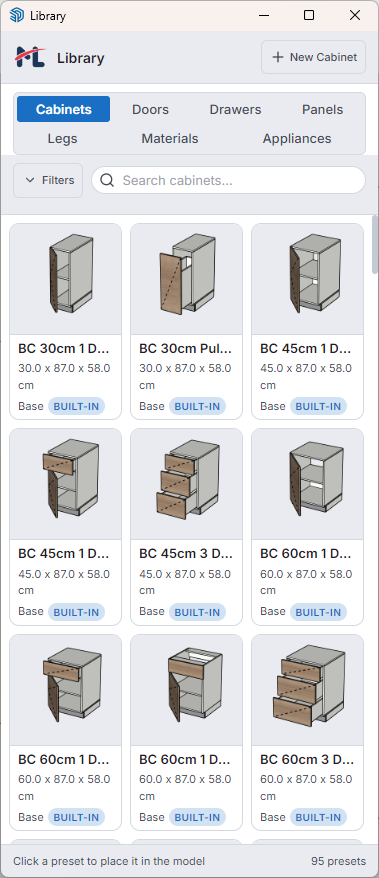
A persistent panel that serves as the creative hub for your entire ML Cabinets asset collection. Browse and place saved cabinet designs, swap door panels and handles, change drawer fronts — all from a tabbed visual catalogue.
Four Tabs
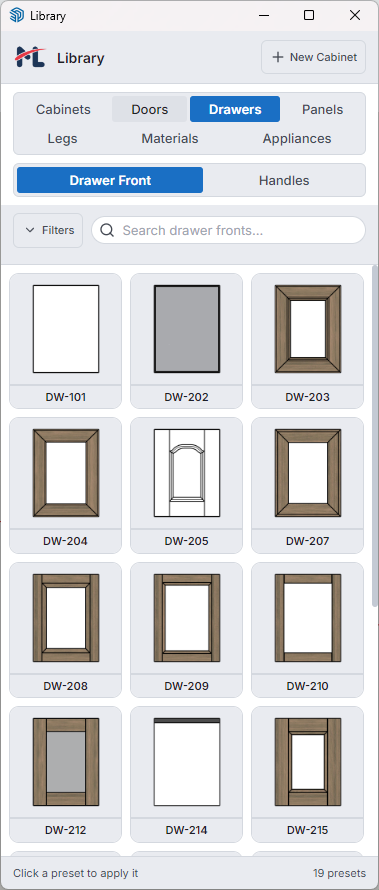
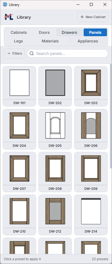
- Cabinets — browse and place saved cabinet presets. Click a card to build and enter Placement Tool.
- Doors — sub-tabs for Door Panels and Handles. Click to activate Apply Preset Tool; click a cabinet to repaint all doors.
Alt+click for a single door. - Drawers — same structure for Drawer Fronts and Drawer Handles.
- Panels — End Panel and Decorative Panel presets. Apply to Panel items via click or
Alt+click.
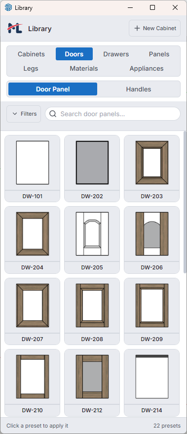
Tip: The library panel stays open while you work — place several cabinets in rapid succession without reopening it each time.
Add to Library
Turn any 3D component into a reusable preset. Select the component, click Add to Library, confirm the name, and it is saved immediately.
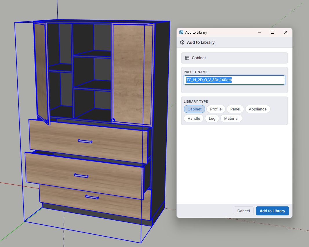
The extension recognises the component type automatically and saves it to the correct category: Legs, Profiles, Panels, Handles, Appliances, Materials, or Cabinets.
Profile Presets
Save any 2D cross-section — a gola rail, LED channel, decorative cornice — as a named preset for the Profile item selector.
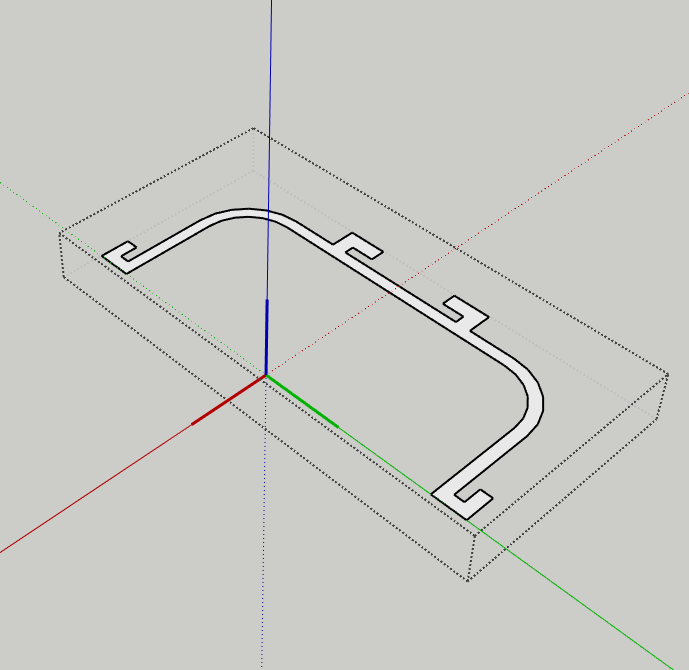
Important — Axis placement:
- Origin at the front centre of the bottom edge
- Red axis (X) = profile depth
- Green axis (Y) = profile width
- Blue axis (Z) = extrusion height
Panel Presets — Door Panels & Drawer Fronts
Save a flat panel (Shaker door, slab drawer front, end panel) and assign it roles: Door Panel, Drawer Front, Decorative Panel, or End Panel. The preset appears in the corresponding tabs automatically.
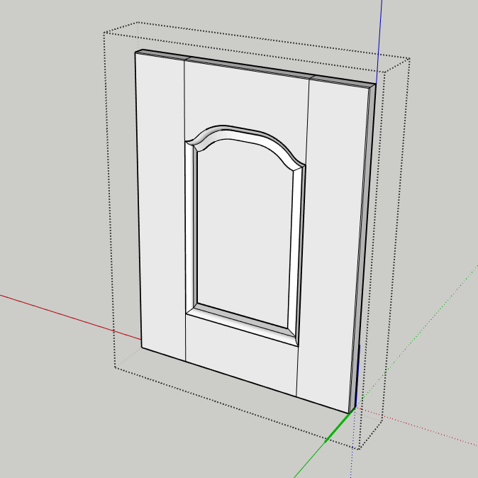
Important — Axis placement:
- Origin at the bottom-right corner of the front face
- Red axis (X) = panel width
- Green axis (Y) = panel thickness
- Blue axis (Z) = panel height
Tip — Nine-part panels: For decorative details that should not distort when scaled (moulded frames, routed profiles), build the panel as a Dynamic Component divided into a 3×3 grid. Corner pieces stay fixed; edge pieces stretch in one direction; only the centre scales both ways.
Handle Presets
Save any 3D handle component as a reusable preset. Orient the handle vertically with the centre as its pivot point. The saved handle appears in both Door and Drawer handle pickers.
Appliance Presets
Save any volumetric 3D appliance (oven, dishwasher, microwave, etc.) with two behaviour flags:
- Fixed Size — locks the appliance to its saved dimensions (recommended for manufacturer-specified enclosures).
- Free Standing — places the appliance at the cabinet's floor level (for tall appliances like refrigerators).
Material Presets — Custom Textures
Drag an image file onto the SketchUp viewport, select the Image entity, and click Add to Library.
- Drag a PNG or JPG onto the viewport to create an Image entity.
- Select it and click Add to Library.
- Choose the finish category (Wood, Marble, Metal, Color, Glass).
- Click Draw Grain Line and draw two points along the grain direction.
- Confirm the name — the material is saved with its grain orientation.
Cabinet Presets — Save & Reuse Entire Cabinets
Save a fully configured cabinet — every dimension, layout, material, handle, and construction detail — as a library preset with a clean thumbnail. Recreate the exact same unit in any future project with a single click.
- Select a placed cabinet.
- Click Add to Library.
- Confirm the name — the complete configuration is saved.
- The preset appears in the Asset Library's Cabinets tab immediately.
Cabinet Schedule Manager
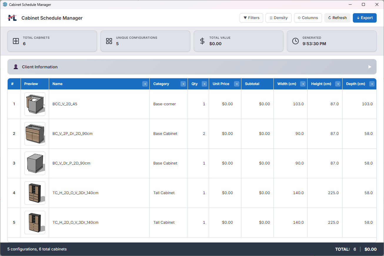
Scans every ML Cabinets cabinet in the active model, groups identical configurations into single line items with combined quantities, and presents the complete project schedule in an interactive table.
Stat Cards
Four summary cards at the top show: total cabinets, unique configurations, total project value, and the time the schedule was last generated.
Schedule Table Features
| Feature | Detail |
|---|---|
| 14 columns | Row number, thumbnail, name, ID, category, quantity, unit price, subtotal, width, height, depth, door count, drawer count, shelf count |
| Sortable | Click any column header to sort ascending/descending |
| Filterable | Text columns support substring matching; numeric columns support comparison operators (>, <, >=, <=, =) |
| Column presets | Minimal, Standard, All Details — switch visible columns in one click |
| Row density | Compact, Normal, Comfortable row heights |
| Inline editing | Double-click Name or Unit Price to edit directly in the table |
| Row click | Select and zoom to matching cabinets in SketchUp |
Client Information
A collapsible panel records client name, mobile, email, and address — saved in the SketchUp model file and included in exports.
Export
- Export CSV — standards-compliant CSV with client header for Excel, Google Sheets, or costing software.
- Export HTML — print-ready HTML with thumbnails, totals row, and date. Open in any browser and print or save as PDF.
Automatic Layer Organisation
Every time a cabinet is placed, ML Cabinets sorts every component into a named layer inside a dedicated ML Cabinets layer folder — with zero manual effort.
| Layer | What It Contains |
|---|---|
| Carcass | Side panels, base, top, back, toe kick, shelves, blanks |
| Doors | All door leaf instances |
| Drawers | Drawer box carcasses and drawer face wrappers |
| Panels | Decorative panels, drawer faces, end panels, separators, dividers |
| Legs | All leg instances |
| Handles | Door and drawer pull handles |
| Profiles | Decorative profile strips |
Tip: Toggle the Doors layer off in SketchUp's Tags panel to hide all doors and inspect the carcass construction. Toggle layers to create selective presentation views.
Shortcuts & Tips
Placement Tool Shortcuts
| Key | Action |
|---|---|
← → | Cycle insertion corner |
↑ ↓ | Toggle bottom / top anchor |
[ ] | Rotate 90° CCW / CW |
Space | Cancel placement |
Interactive Tools
| Tool | Activation | Exit |
|---|---|---|
| Open / Close | Toolbar button or Extensions menu | Switch tools |
| Swap Door | Toolbar button | Space or switch tools |
| Swap Grain | Toolbar button | Space or switch tools |
| End Panel | Toolbar button | Space or switch tools |
| Style Picker | Toolbar button | Esc (twice to fully exit) |
Style Picker
| Action | Behaviour |
|---|---|
| Click (pick mode) | Pick source cabinet style |
| Click (apply mode) | Apply full style to target |
Alt+Click (pick mode) | Open property filter dialog |
Esc | Return to pick mode / exit |
Asset Library
| Action | Behaviour |
|---|---|
| Click preset card | Apply to all matching items in cabinet |
Alt+Click cabinet | Apply to single item only |
Pro Tips
Use the Style Picker as a batch updater. When a client asks to change every base cabinet's door style, pick the reference cabinet once and click every target — faster than editing each one individually.
Zero means auto-fill. Setting a group or item height to 0 tells ML Cabinets to calculate the remaining space automatically. Use this for flexible zones that adapt to the cabinet height.
Save your go-to designs. After configuring your most-used cabinet, click Add to Library to save it as a preset. Your library grows with your practice and makes every future project faster.
Use Bulk Edit for project-wide changes. Select all cabinets, open Edit, change a single field (e.g., depth), and Apply — every cabinet updates while keeping its individual configuration.
ML Cabinets v3.2.0 — © 2026 ML Extensions
What's New in 3.2.0
Inner Drawers
Version 3.2.0 adds cabinet-fixed Inner Drawers to eligible left- and right-hinged doors, double-door pairs, and regular drawers. Add and reorder sibling drawers, then configure each child's height, box, inset front, handle or profile, material, and opening amount.
The hierarchy is retained through New, Edit, Bulk Edit, session, defaults, units, library, schedule, and manufacturing-preparation workflows. Parent and child motion is coordinated: children close first, and linked double-door leaves complete their motion together.
Check shelf clearance visually: shelves and Inner Drawers can coexist, but the extension does not automatically report collisions.
Recent 3.1.0 additions
- Custom shelf spacing stores a clear distance below each shelf while the top remainder adapts to valid cabinet-height changes.
- Sliding Door adds a two-panel bypass assembly with selectable front-track assignment.
- Bi-Fold Door adds four linked vertical leaves that open as two folding pairs.
- Lift Door adds two horizontal leaves that fold together and lift upward.
These assemblies participate in configuration, materials, grain, preview, SketchUp animation, schedules, and supported manufacturing workflows. Read the release notes for the complete customer-visible history.